Map or satellite - two ways to see your virtual route
· Karl
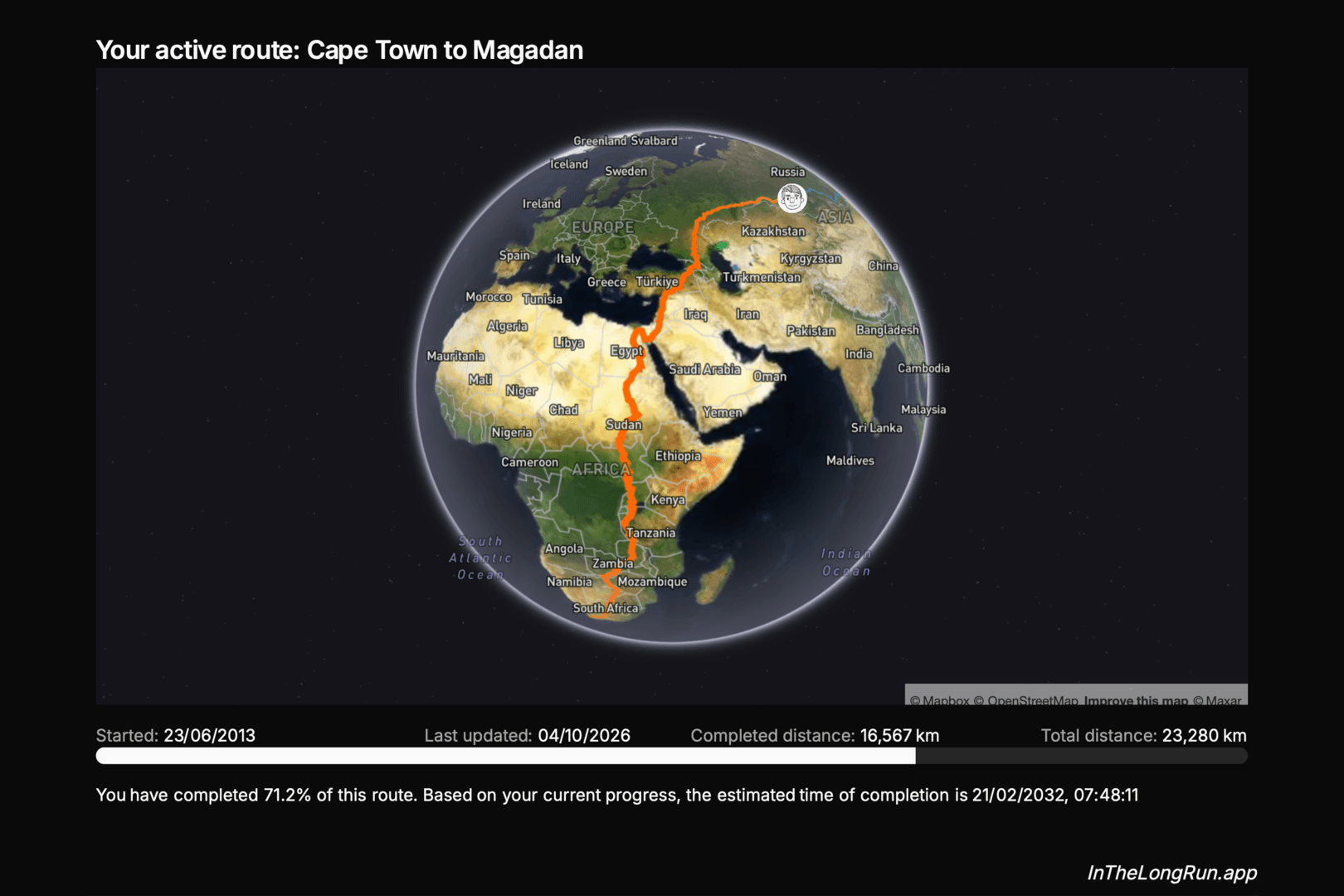
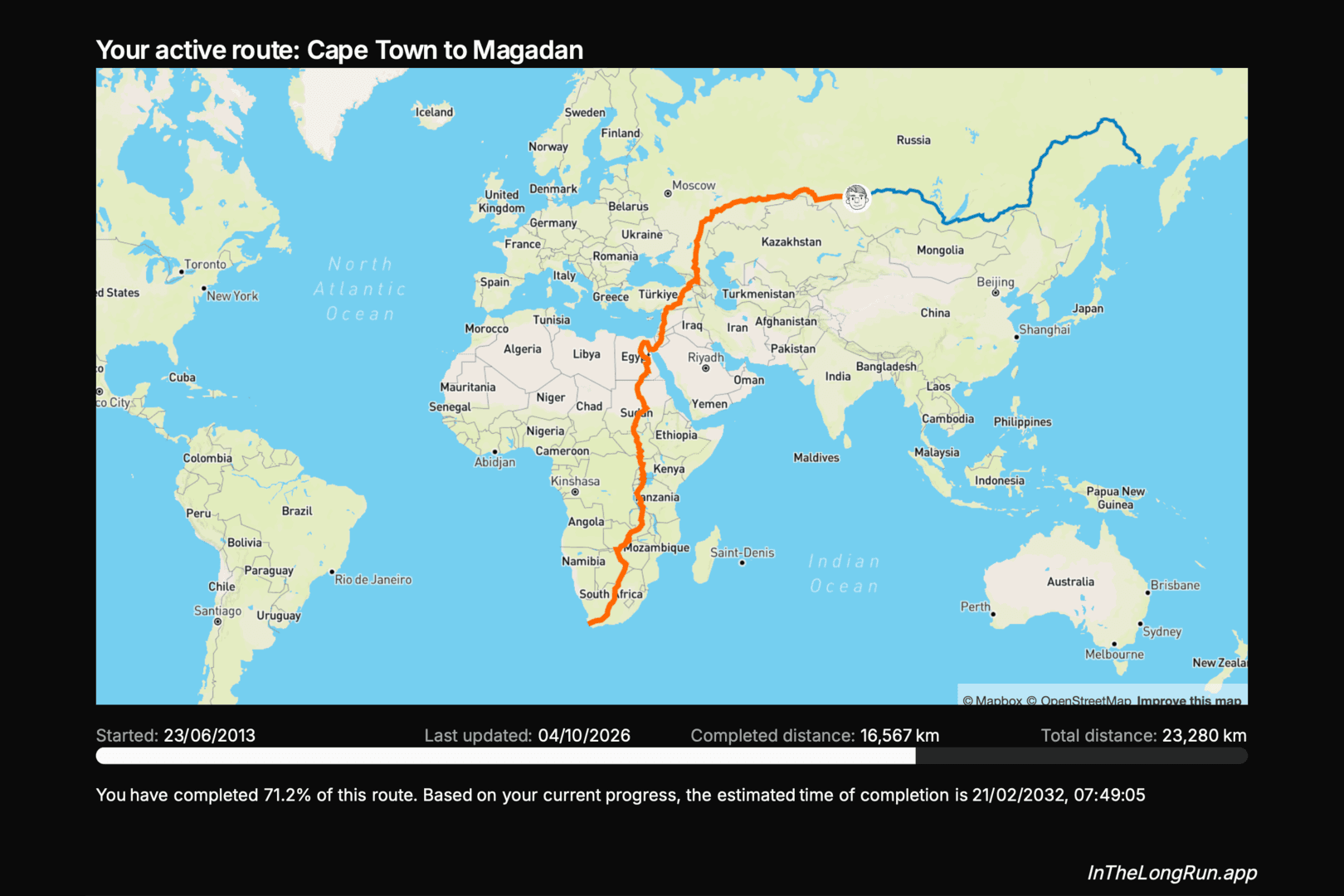
Our virtual routes now have a Map / Satellite toggle in the top right corner, so you can switch between the familiar street map and a satellite view of the actual ground you are covering. It works on your own routes and on group maps, the route, your progress and any points of interest come along whichever view you pick.
The map view: where you are
The street map is the one you already know. It is clean, easy to read, and shows you the things people put on the ground: borders, cities, roads, place names. That makes it the view for answering where am I? Which country you have crossed into, which town is coming up next, how close the route runs to the coast. Zoom in and you can follow the roads you would actually be running on.
The satellite view
The satellite view answers a different question: what is it like out there? Here the route stops being a line between place names and starts running through terrain. You can see where the green of the Nile valley gives way to desert, where the highlands rise, where a mountain pass actually is and how far the next forest stretches. On a long route it is the closest thing to looking out of the window. The place names and roads are still drawn on top, so you can switch over without losing your bearings.
Zoomed out, the satellite view also shows the whole route on a globe rather than a flat map, which brings us to the other difference between the two views.
A word about Projections
The street map uses the Mercator projection, the same one almost every web map uses. Gerardus Mercator drew it in 1569 for sailors: any straight line on it is a constant compass bearing, and shapes are true locally, which is also why it works so well for zooming into a street. The price is size. The further a place is from the equator, the more it is stretched, so Greenland looks about as big as Africa when in reality Africa is around fourteen times larger, and Russia looks like it could swallow the whole continent. It is a trade-off people have strong feelings about, as xkcd has documented.
For a runner it means the northern stretches of a long virtual route look longer than they are. On the Cape Town to Magadan map above, the Siberian leg looks longer than the run through Africa, when on the ground the two are much closer. The globe in the satellite view has no such distortion, so when you zoom out it shows your progress in true proportion. As you zoom in it flattens back out, and at the scale of a day's run the difference is too small to matter.
Go find a route and try both. A long one like the Pan-American Highway, running from the Arctic almost to Antarctica, is where the two views differ the most.
Blog posts are written by and in collaboration with large language models (LLMs) / AI.